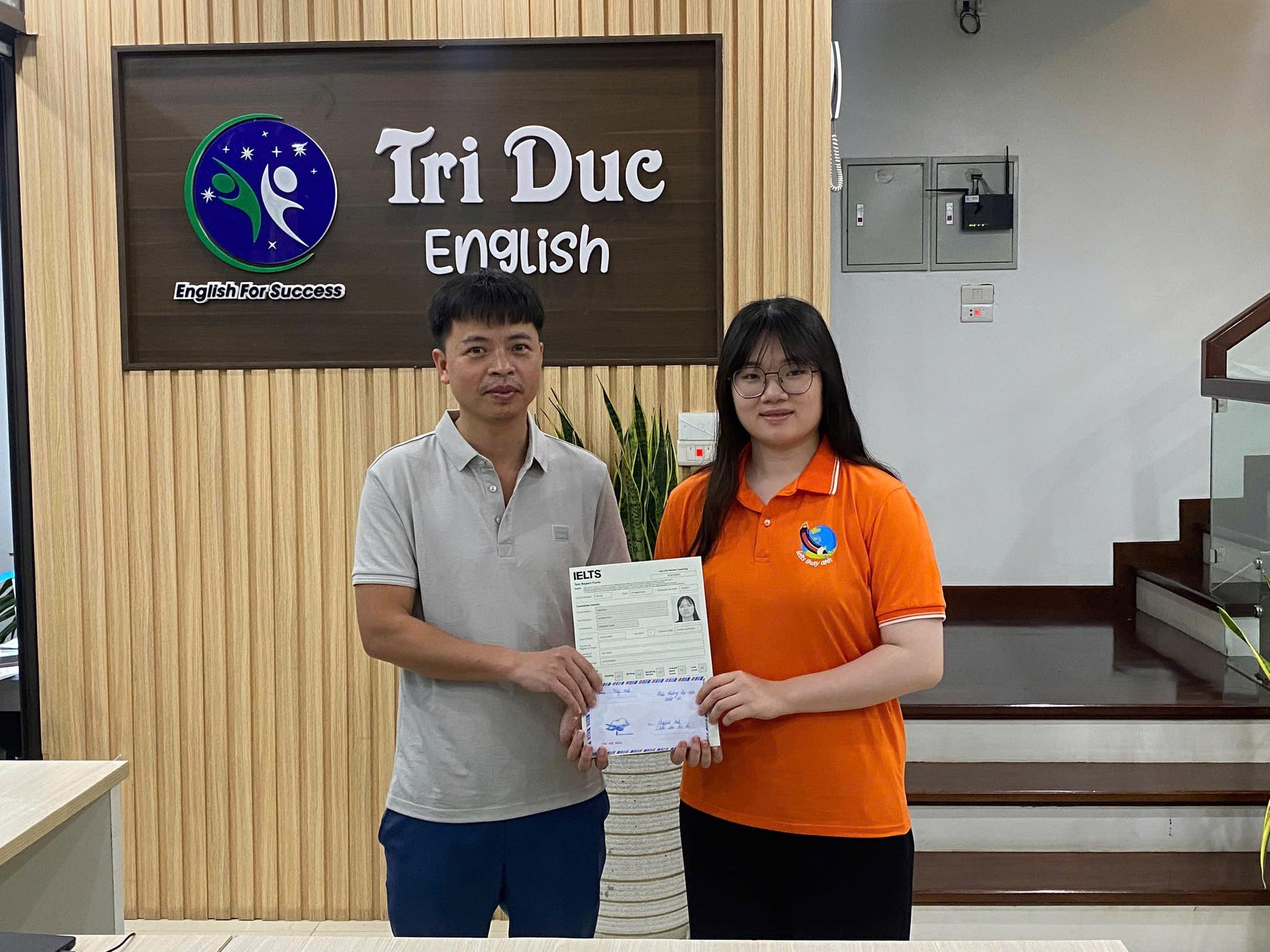
Tag Archives: pie chart

Sai lầm hay mắc khi viết biểu đồ tròn

Thầy Anh tổng hợp những sai lầm học viên của thầy hay mắc khi mới học viết biểu đồ tròn

Đề bài thường có 2 biểu đồ tròn như hình trên

Một số sai lầm khi viết biểu đồ tròn

Sử dụng peak

Ví dụ: Urban reached a peak at 50% in 2015. Chú ý: peak hay dùng trong biểu đồ đường hơn nhé

Viết lại: Urban accounted for 30% in 1915 while it increased sharply to 50% for last century

So sánh 2 mục khác nhau ở 2 biểu đồ khác nhau

Ví dụ. in 1915 Rural made up 60% which was higher than urban 50%

Giải thích: Chỉ so sánh mục cùng loại để thấy sự tăng giảm

Viết lại: in 1915 Rural made up 60%, and then it decreased dramatically to 10% in 2015

Sử dụng chênh lệch phần trăm không hợp lý

in 1915, Rural was 30% higher than Urban.

Giải thích: Vì Rural gấp đôi Urban nên viết như trên chưa hợp lý

Viết lại: The percentage of people living in rural was twice than that of of urban.

Bài mẫu task 1 piechart

Presented by Thầy Anh

Nhận xét:

Bài này viết đủ từ cũng hơi khó

Cần đưa kết bài và thêm lời vào thì mới đủ từ được: Agriculture and fishing, More people earned jobs due to the fact that became less popular…

Chú ý các từ thầy paint colour

Two pie charts show how the workforce was distributed in Britain in the year 1932 and 1992.

Overall, the dominance of industry was replaced by the services. Besides, more people got jobs in 1992 than 1932.

In 1932, Industry accounted for 42% which was the highest proportion. Then it decreased dramatically to 15%. Next, Agriculture and fishing became less popular. It took up 15% in 1932, followed by a decrease of 8% in 1992. More people earned jobs due to the fact that the rate of unemployment went down from 25 % to 10%. In contrast, 1992 witnessed a considerable rise in service that rocketed to over a half in the total. Moreover, the percentage of People working in the government sector increased five-folds from 3% to 15%, making it the biggest increase among sectors of workforce. 

In summary, there were a great deal of changes in workforce distribution between 1932 and 1992. The biggest changes belonged to Industry, Services, government 

(158 words)

pie chart writing sample

You should spend about 20 minutes on this task.

The three pie charts below show the changes in annual spending by local authorities in Someland in 1980, 1990 and 2000.

Summarise the information by selecting and reporting the main features, and make comparisons where relevant.

Write at least 150 words.

saw a fall        

45%          

9%    

rose dramatically           

  10%             

40%

Model answer

The charts show how much local authorities spent on a range of services in Someland in three separate years: 1980, 1990 and 2000.

In all three years, the greatest expenditure was on education. But while K-12 education

saw a fall
from 25% in 1980 to only 18% of spending in 2000, higher education remained the largest proportion, reaching
45%
of total spending in 1990 and ending at
40%
in 2000.

Expenditure on health and human resources had increased to 20% by 1990 before decreasing to only
10%
by the end of the period. In contrast, the share of transportation saw an opposite trend. This cost decreased to only 6% of total expenditure in 1990 but
rose dramatically
in 2000 when it represented 22% of the total budget. Similarly, the cost of environmental services saw a rising trend, growing from only 4% to
9%
by 2000.

Overall, higher education constituted the largest cost to local authorities, and while spending increased for transportation and environmental services, there were corresponding drops in expenditure on health and human resources and K-12 education.

(178 words)